Site Redesign
Inspired by Twitter's Bootstrap, I bring to you the new version of Pyjama Coder!
In addition to the CSS revamp, you will notice a few other things have changed.
- the homepage now lists excerpts from up to 5 posts and is paginated
- there is a sticky navigation bar at the top of the page
- the old post listing has been moved to a blog page
- the site is responsive for widths of: 480, 768, 980, 1200, and 1200+
There are also a few fun css additions.
The move to Bootstrap
ghe first version of Pyjama Coder was using a version of normalize.css from the HTML5 Boilerplate project. Then applying some CSS media queries to make the site responsive.
To move from that setup to Bootstrap was pretty simple. All I did was include a compiled version of bootstrap.min.css, that they had already compiled, and their CSS file for responsive design. I ended up using their unminified responsive CSS file because I wanted to tweak when something was happening, which I'll get to later.
The nice thing about Bootstrap, is that they have a site with pretty good documentation on its use. Their default grid layout is fairly simple to use and they have examples of everything.
Making the transition was more about tweaking the HTML and CSS to conform to the way their markup is done. I found a lot of the little things, like setting max-width: 100% on image tags, were already done and tested for you.
In the end, you have a nice looking site without having to do any heavy lifting.
The sticky navbar class they have really makes it extremely easy to have one of those fancy bars they have no top of a lot of sites these days.
The homepage
I'll admit, looking at the homepage was pretty dull.
Whenever I visit a blog, I enjoy reading the teaser / excerpt before diving into a post. Especially after I read a good article and want to see if there's anything else worth reading.
I wasn't sure of the best way to implement this but knew someone else had probably done this before. After all, Jekyll is pretty popular among bloggers these days.
A few minutes of googling and I came upon this article on creating excerpts in Jekyll by Jacques Fortier.
His solution was to create a simple plugin that checked for the text <div data-excerpt /> and split the post. He also mentions how to paginate your posts using Jekyll, which was a huge bonus.
You saved me a lot of time Jacques and I thank you for that!
Responsive Layouts
As I mentioned before, there are 5 widths being supported now. The responsive CSS that Bootstrap provided was a good base to work off of.
I had to use their non-minified one to tweak the navbar style to change at a lower width than the default they set.
Other than that, the only thing you have to watch out for are some edge cases like declaration of @media (min-width: 768px) {...} combined with something like @media (min-width: 480px) and (max-width: 768px). You might not get what you expect at 768px, for instance.
3 Different Menus
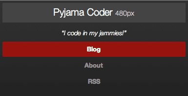
Small - up to 480px
Medium - 480px to 768px
Large - 768px+
2 Different Layouts
One Column - up to 768px
Two Column - 768px +
A Few Fun Features
If you noticed, in the navbar, it says something like 480px or 1200px next to the words "Pyjama Coder". I added those to let me know when each of the responsive layouts kicks in.
If you resize your browser from 980px to 1200+px, you'll notice the elements slide over. This was achieved by adding this to the @media min-width(980px) block:
  .container {
    -webkit-transition: all 0.2s ease;
    -moz-transition: all 0.2s ease;
    -o-transition: all 0.2s ease;
    -ms-transition: all 0.2s ease;
    transition: all 0.2s ease;
  }
I chose that block because going from 980 to a lower one was kind of glitchy. At a few pixels, between layouts, the animation would cause the browser width to change back and forth triggering a seizure inducing infinite loop of stuff bouncing around.
It's neat to see the things animate into their new positions as you the layout changes. You can even make hidden elements fade in and have colors transition from one to another.
The last thing was getting the "About the Author" block to stay fixed. Because of the way Bootstrap's CSS is, adding position: fixed; didn't work out so well. Upon inspecting the element, you'll see a class of .fixme which has a different margin set depending on which media query it was running.
Give It A Try!
Overall, it was a pretty fun experience. I recommend giving Twitter Bootstrap a try if you have the time. It's quite easy to use and has many features which I haven't even touched upon.


