Now, Mobile Friendly!
Preface
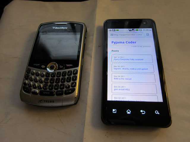
Ever since the summer, I've taken more of an interest to mobile related things, especially since I switched from a BlackBerry Curve 8330 to an LG Optimus 2X. I went from a phone with, basically, a text only web browser to one that could load mobile sites, pretty nicely.
I remember seeing things like HTML5 Boilerplate and jQuery Mobile, which aim to help make sites more mobile friendly, and thinking that they were pretty neat. I saw a great example of a site that executed the whole mobile thing pretty well — The Boston Globe's website.
My first reaction was:
Wow, the site resizes itself to fit the browser window, and at certain points the layout changes completely!
It's not really amazing from a technical standpoint but from a usability perspective, it's pretty awesome.
It's Actually Quite Simple
Fast forward to the holiday season of 2011, I saw this blog post by Jonathan Verrecchia.
I gave it a quick read and it turns out there isn't really much to it. You simply use css media queries.
The css looks something like this:
/* for any browsers less than 480px wide */
h1 {
  font-size: 1.25em;
}

/* for any browsers greater than or equal to 480px and less than 768px */
@media only screen and (min-width: 480px) {
  h1 {
    font-size: 1.5em;
  }
}

/* for browsers greater than or equal to 768 px */
@media only screen and (min-width: 768px) {
  h1 {
    font-size: 2em;
  }
}
That's all there is to it.
In this example, as the browser size gets wider, the h1 size gets bigger. Of course, you can do anything you want, like change from a one column layout to 2 columns, or even show more things as your screen real estate gets larger.
Maximal Width
Jonathan also mentions the idea of a "maximal width" view so your readers aren't reading one line paragraphs.
@media only screen and (min-width: 1140px) {
  .wrapper{
    width: 1026px; /* 1140px - 10% for margins */
    margin: 0 auto;
  }
}
It's just your basic page centering mechanism using margin: 0 auto; and setting a width.
One More Thing
In the examples above, as the browser width increases, you inherit all of the declarations from each level. Sometimes this isn't ideal.
For this site, I had some things floated in one of the intermediary layouts that I didn't want for the next level.
This is very easy to deal with, also. You can clamp the size to a specific range like this:
/* fit for 480 to 767 px only */
@media only screen and (min-width: 480px) and (max-width: 767px) {
  /* your stuff here */
}
That's it! Pyjama Coder is now more user friendly at many different resolutions :D
Reisze your browser, I dare you!!
